
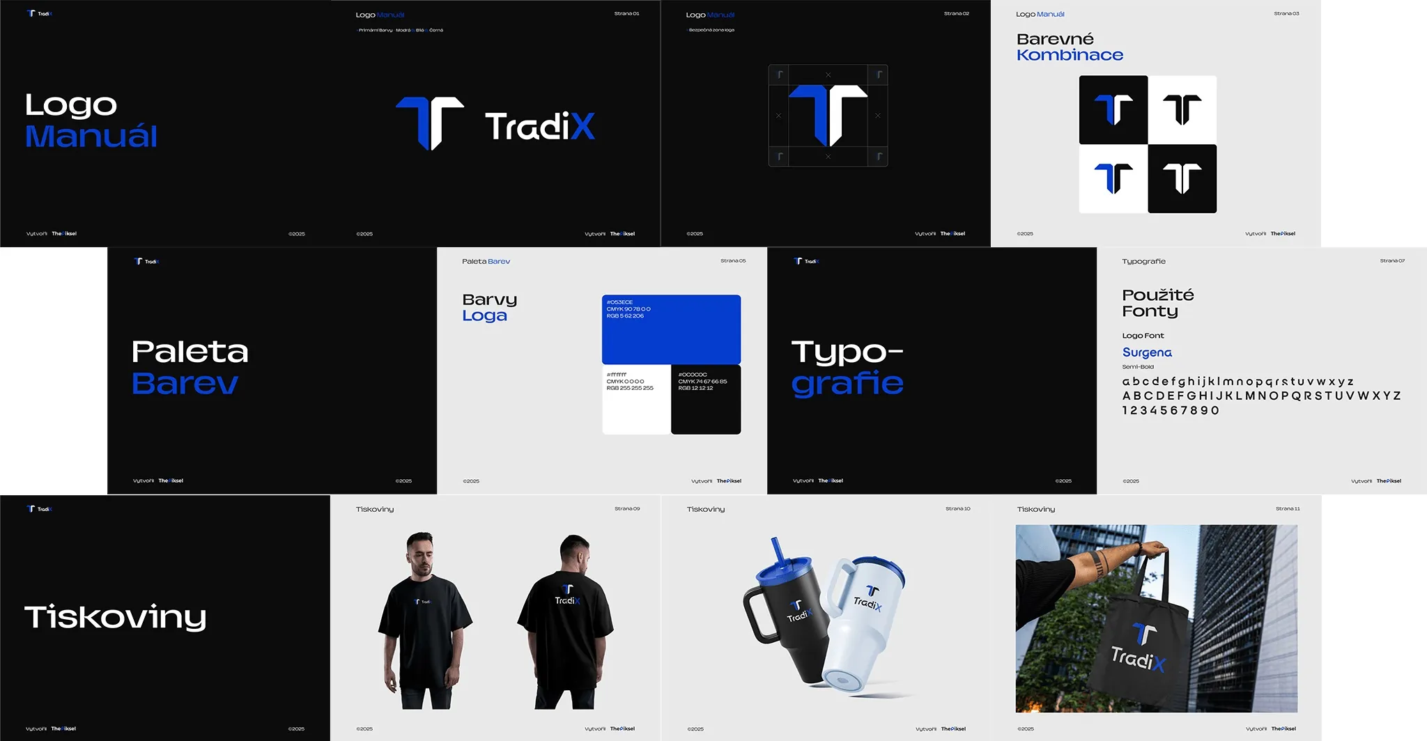
We created a logo manual for the Tradix brand. It sets out how the logo is used, in which colour combinations, which typeface the brand speaks in and how it looks in print.
The brief.
The brand needed consistent rules so it looks the same on dark and light backgrounds and in print.
How we solved it.
The manual is built on the T mark and a blue and black palette. It covers the logo’s construction and colour combinations.
The final section shows the brand on clothing, travel mugs and bags.


What the client got.
- Logo manual
- Colour palette
- Typography
- Print materials
Like Tradix?
We will build yours too.
Tell us a little about your company and what you need. We will get back to you by email or phone and agree on the next step.